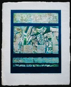
Brenda Hartill
- Depth and expression of colour is beautiful. The colours in her Blue and silver icons work, looks almost as if she has used the inside of paula shells to create with. She manages to capture that iridescent shimmer and sheen really well.
- The addition of silver or gold leaf, highlights the images well and adds a richness and touch of magic to the prints.
- Abstract imagery inspired by light, landscapes and organic forms. To me, her work seemed quite ethereal and elemental. Her images spoke to me on a spiritual level, leaving me filled with a wonder and sense of calm.
- She explores and expresses texture and pattern well and I really wanted to know more about her process- how she creates that pattern, how she mixes her colours to create that beautiful sheen and texture.
- She also uses collograph, etching, collage and embossing.
- One of her pieces ‘Summers End’ looked like an art quilt piece, heavily stitched with rich threads. I had to look to see if it was fabric but it is an embossed watercolour.
- To me, her works have depth, vivid colour and excitement, not the normal style of collograph I have seen.


Images from www.brendahartill.com
Laurie Rudling
- I found a lot of his images, especially the etchings, very flat after looking at Hartills work.
- There is a lot of very fine detail in the works but some of his colours are very muted. I’m not sure he achieves the depth of colour and texture seen in Hartills work.
- He uses layering and overlapping to good effect, E.G. in the print ‘Hamnavoe’ the houses are overprinted in some areas which makes it appear there are more houses than there actually are.
- There is more energy in his prints of birds, especially ‘Enough to make a summer’. The shadowing lines create movement across the print.
- He takes inspiration from the built environment and natural landscape. His architectural prints have very fine detail but still appear quite flat to me. Obviously a very talented artist to create such intricate work, but in comparison to Hartill’s work, his work just didn’t come alive for me.


Images from https://www.laurierudling.co.uk/
John Ross
- Married to Clare Romano, they are both printmakers who have worked on a lot of art for books and other projects together. This made it quite difficult to distinguish their work from one another, as they tend to get credited together.
- John’s work looks to be quite structural and architectural whereas Clare’s work has a more childlike quality to it- not in terms of technique but in subject-simplified images of people and children.
- They both did works inspired by the grand canyon. Clare’s work of this subject is a little more abstract and brighter in colour. John’s work has more realism and a lot of texture and his colours are a little more muted.


Paul Klee
- Klee had many different styles- expressionism, surrealism, cubism and abstract. He was heavily influenced to experiment with colours by artist August Macke.
- I could not find much information about his printing methods.
- Some of his works look like other artists’ works, E.g I could tell which works had been inspired by Kandinksky.
- I found it hard to be inspired by his work as he doesn’t really have his own style, something that would set him apart from other artists.
- He moves through different art movements being inspired by different artists of those movements.
- His portraits are abstract, overly simplified. He uses trace monotype and then works back into the prints afterwards, adding more depth and detail.


Images from artnet.com and https://www.guggenheim.org/blogs/findings/prints-paul-klee
Edgar Degas
- He produced around 400 monoprints- I did not know that he used printing as one of his techniques, I was only really aware of some of his paintings, so it was nice to discover this.
- He used scraping, brushing, finger painting, wiping and drawing onto the plate to create textures and a sense of light.
- He normally worked in black ink which gives a sense of atmosphere and drama to his works. They can be quite intense with small highlights created using the above techniques to create the illusion of light.
- He printed ghost prints and worked back into them with colour, normally pastels.
- Although these works are not detailed, the use of texture and tone and the way he created light, convey a level of detail that’s not really there.


Images from https://www.pegasusart.co.uk/blog/workshop-news/when-degas-fell-in-love-with-monotype-printing/
Henri Matisse
- Considered to be one of the greatest and diverse printmakers (according to Christies website)
- He uses line well to capture body images that have a flow and fluidity to them
- He uses simple, abstract designs
- His earlier paintings are much more detailed than his monotypes. With the monotypes he tends to keep with simple flowing lines, a suggestion of image in some cases.
- His work with printmaking and cutouts, or painting with scissors as he called it, is much freer and stylistic.
- He uses contrast well, white lines on black, black lines on white, to create a greater impact.
- I like the simplicity of his lines and lack of detail, he manages to convey body form very well with what sometimes looks like one continuous line.


Images from https://www.moma.org/explore/inside_out/2015/01/29/matisses-monotypes-an-unexpected-installation/
Paul Gauguin
- He was very experimental in his work and is said to have developed the technique called trace monotype which were oil transfer drawings.
- Scientists have analysed his prints to see how they were made. Their conclusion seems to be that he re-used the inking plate without removing previous marks, so they showed up on subsequent prints, adding a layer of depth and intrigue to his work.
- He combined myths and legends from different cultures to create some of his trace monoprints.
- With his monotypes he added different tones to the original print by inking up another sheet with olive ink and placing the print face down on top and applying selective pressure to where he wanted extra depth, to transfer the new colour of ink on top. This gave some earthy tones to his work.
- His works like this are double sided- the side where he drew the image while on the inking plate and then the transfer print on the other side.
- I like the primitive subject matter in some of these monotypes and the detailed yet simple drawings. They are very different from the style of his paintings.


Images from https://www.moma.org/explore/inside_out/2014/04/16/metamorphoses-paul-gauguins-oil-transfer-drawings/
Other artists I found inspiring
Susan Bowers http://trace-marks.blogspot.com/


Kim Major-George https://www.majorgeorge.co.uk/gallery/


Sally Hirst- excellent free (until the end of June 2020) workshops on her youtube channel collographs, monoprinting etc http://www.sallyhirst.co.uk/

My printing techniques Pinterest board (for all types of printing, workshops, tutorials and inspiration https://www.pinterest.co.uk/lunaiow/oca-printing-techniques/
